
Based on my professional experiences, I've often observed a recurring need among companies with multiple applications developed using various technologies such as Angular, Vue, or React.
These companies aim to build a Design System, accompanied by associated component libraries, to unify the user experience across their production applications. The goal is to ensure visual and functional consistency while optimizing collaboration between product, design, and development teams.
TL;DR:
In this article, I explore the use of Stencil.js to create a multi-framework (React, Vue, Angular) Design System with Web Components. Despite its strengths (interoperability and centralized design tokens), Stencil has limitations, particularly regarding TypeScript typing and integration into certain frameworks.
I also share a concrete implementation with Figma, design token scripts, and wrappers for each framework. While promising, Stencil isn't always the ideal solution for a Design System, and other approaches may be more suitable depending on specific needs. Source code available here: Stencil Design System Repository
What is a Design System?
A Design System is a coherent set of principles, tools, and resources aimed at standardizing and facilitating the design and development of digital products. It addresses all stakeholders in product teams—designers, product managers, and developers—to encourage effective collaboration and ensure a consistent user experience while offering the flexibility needed to adapt to the specific requirements of projects.
This flexibility is based on fundamental principles such as:
L’Open-Closed Principle: Allowing extensions and adaptations without modifying the base elements (Open-Closed Principle in React)
Composability: Ensuring that different system elements can be combined and reused to meet various use cases.
It generally comprises three main dimensions:
1. Design Standardization:
Focuses on the visual aspect and interactions within interfaces.
Provides guidelines to ensure a uniform user experience across all interfaces.
Includes reusable visual components, consistent interaction rules, proven design principles, and standards for elements like typography, colors, or animations.
2. Business Specification:
Defines rules and constraints specific to the organization's or product's needs.
Aligns business and technical objectives by translating functional requirements (e.g., regulatory compliance, preferences specific to each market or region, or local performance and content requirements).
Serves as a bridge between business objectives, design, and technology, facilitating smooth collaboration among different stakeholders.
3. Ressources and Tools (assets):
Includes mockups, UI components, typographic rules, color palettes, and design tokens (variables that ensure design consistency in code).
S'accompagne idéalement d'une documentation accessible et maintenable, décrivant les bonnes pratiques et les cas d’usage.
Technical Requirements for a Design System
As a developer, I've identified a list of essential technical requirements for developing components associated with this system:
TypeScript support
Efficient Design Token Management
Storybook Support for implementing, documenting, and visually testing components
Seamless Integration into applications using Angular, Vue, or React
While exploring various technical options, one solution frequently emerges: Stencil.
Why Stencil?
Stencil is a compiler that generates Web Components while offering native support for frameworks like Angular, Ember, Vue, and React. This makes it a promising and popular solution for creating reusable component libraries within a Design System.
In the following sections, we'll explore building a Design System based on Stencil and assess its ability to meet the identified requirements.
Implementation
Design
For this study, we've designed a minimalist interface in Figma featuring two components: Button et Link.
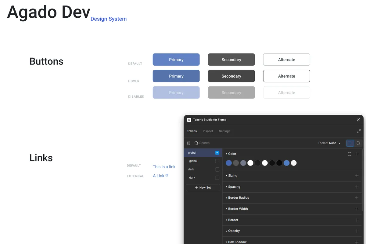
These components utilize design tokens to define colors. With the help of Tokens Studio for Figma, we exported the tokens directly into the codebase, making Figma the single source of truth for the Design System.
Code
Integrating Design Tokens
To integrate design tokens into our components, we developed a simple script that transforms the tokens into CSS variables:
generate-css-variables-from-design-tokens.ts
import fs from 'node:fs';
import { resolve } from 'node:path';
import { DESIGN_TOKENS } from '../src/styles/design.tokens';

const cssVariables = Object.entries(DESIGN_TOKENS)
.map(([colorname, values]) => ` --color-${colorname}: ${values.value};`)
.join('\n');

const cssVariablesInRoot = `:root {\n${cssVariables}\n}`;
fs.writeFileSync(resolve(__dirname, '../src/styles/design-tokens.css'), cssVariablesInRoot);
This script generates a CSS file containing all the necessary variables, making colors easily accessible within our components.
design-tokens.css
:root {
  --color-primary: #6283c4;
  --color-primary-hover: #5673ac;
  --color-text: #f0f0f0;
  --color-secondary: #565656;
  --color-secondary-hover: #454545;
  --color-secondary-text: #e0e0e0;
  --color-light: #c9d9fb;
  --color-link: #4f7dc7;
}
Creating the Component Library with Stencil
We implemented our Stencil component library within a monorepo using pnpm. However, an initial challenge arose: configuring Storybook for Stencil isn't as intuitive as it is for React, making the developer experience less than ideal.
Specifically, the documentation lacks clarity on the steps required to set up Storybook with Stencil. Additionally, it's not possible to write stories directly in Stencil, necessitating an approach based on lit-html. While functional, this constraint adds complexity, as it requires developers to master an additional tool not native to Stencil.
Here's the implementation of our Button with Stencil
ad-button.component.tsx
import { Component, Event, Prop, h, EventEmitter } from '@stencil/core';
import { AdButtonSizeType, AdButtonVariantType } from './ad-button.model';

@Component({
  tag: 'ad-button',
  styleUrl: 'ad-button.css',
  shadow: true,
})
export class AdButton {
  @Prop() label!: string;
  @Prop() variant!: AdButtonVariantType;
  @Prop() type: 'button' | 'submit' | 'reset' = 'button';
  @Prop() disabled: boolean = false;
  @Prop() size: AdButtonSizeType = 'medium';

  @Event() pressAndHold: EventEmitter<void>;

  private holdTimeout: number | undefined;

  private handleMouseDown = () => {
    this.holdTimeout = window.setTimeout(() => {
      this.pressAndHold.emit();
    }, 500);
  };

  private handleMouseUp = () => {
    clearTimeout(this.holdTimeout);
  };

  private getClassName() {
    return `button ${this.variant} ${this.size}`;
  }

  render() {
    return (
      <button
        class={this.getClassName()}
        type={this.type}
        disabled={this.disabled}
        onMouseDown={this.handleMouseDown}
        onMouseUp={this.handleMouseUp}
        onMouseLeave={this.handleMouseUp}
      >
        {this.label}
      </button>
    );
  }
}
Creating Stories with Storybook
Below are some story examples for the Button component:
ad-button.stories.tsx
import { fn } from '@storybook/test';
import { html } from 'lit';
import { Meta, StoryObj } from '@storybook/web-components';
import { type AdButton } from './ad-button.component.js';
import { AD_BUTTON_SIZES, AD_BUTTON_VARIANTS } from './ad-button.model.js';
export default {
title: 'Components/AdButton',
component: 'ad-button',
argTypes: {
variant: {
control: 'select',
options: AD_BUTTON_VARIANTS,
},
size: {
control: 'select',
options: AD_BUTTON_SIZES,
},
},
args: {
onclick: fn(),
},
} as Meta;
type AdButtonStoryType = StoryObj<AdButton>;
export const Examples = {
render: () => html`<div>
<h1>Button Examples</h1>
<div style="display: flex; flex-direction:column; gap: 1rem;">
<ad-button label="Primary Button" variant="primary" size="large"></ad-button>
<ad-button label="Secondary Button" variant="secondary" size="large"></ad-button>
<ad-button label="Tertiary Button" variant="alternate" size="large"></ad-button>
<ad-button label="Disabled Button" variant="primary" disabled></ad-button>
<ad-button label="Small Button" variant="primary" size="small"></ad-button>
</div>
</div>`,
};
export const Primary: AdButtonStoryType = {
args: {
label: 'Primary Button',
variant: 'primary',
size: 'large',
},
};
export const Secondary: AdButtonStoryType = {
args: {
label: 'Secondary Button',
variant: 'secondary',
size: 'large',
},
};
export const Alternate: AdButtonStoryType = {
args: {
label: 'Tertiary Button',
variant: 'alternate',
size: 'large',
},
};
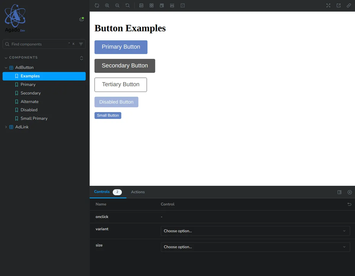
// ...After configuring Storybook and integrating our two components (Button and Link), here's an overview of the result:
Framework Wrappers
Once our Stencil components are created, the next step is to make them usable in our target frameworks: Angular, Vue, and React. We'll evaluate whether Stencil enables seamless adoption within an existing application ecosystem.
Wrapper React
Integration
To integrate Stencil components into a React application, we need to configure Stencil to generate a library specifically for React. This is done by adding a new outputTarget in the Stencil compiler configuration. The Stencil compiler will generate the necessary code in a dedicated package within our monorepo. Here’s how:
stencil.config.ts
import { Config } from '@stencil/core';
import { reactOutputTarget } from '@stencil/react-output-target';

export const config: Config = {
  outputTargets: [
    // ...
    reactOutputTarget({
      outDir: '../react-components/src/lib',
      esModules: true,
      stencilPackageName: '@agado/components',
    }),
    // ...
  ],
  // ...
};
Once this configuration is added and the React library is built (in our case, using Vite), we can use our Stencil components as React components. Here’s an example:
App.tsx
import "@agado/components/design-tokens.css";
import { AdButton, AdLink } from "@agado/react";

function handleLongPress(_event: CustomEvent<void>) {
  console.log("Button pressed and held");
}
function App() {
  return (
    <>
      <div className="card">
        <AdButton
          variant="primary"
          label="Click me"
          onClick={() => console.log("Button clicked")}
          onPressAndHold={handleLongPress}
        ></AdButton>
      </div>
      <div className="card">
        <AdLink href="https://agado.dev" text="Agado" type="external"></AdLink>
      </div>
    </>
  );
}
⚠️ Note: Make sure to import the CSS file containing the design token variables (@agado/components/design-tokens.css) in the React application. Without this, the styles defined in your Design System will not be correctly applied.
Analysis
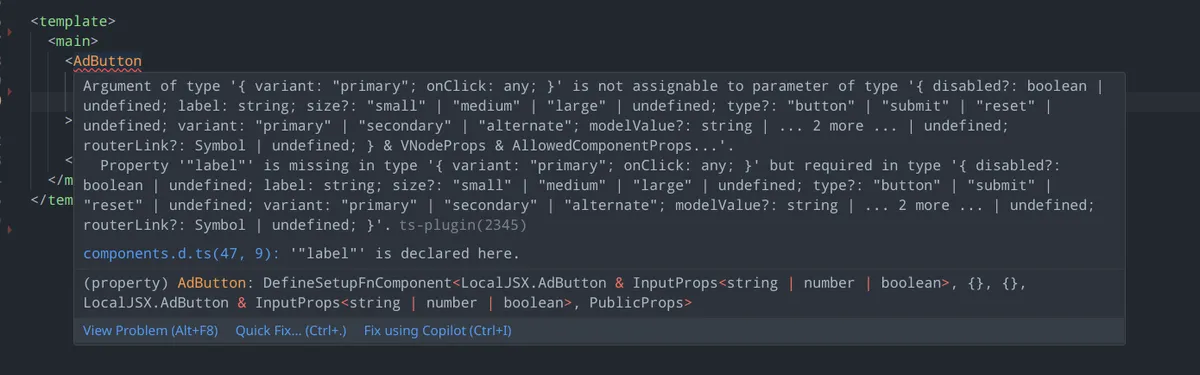
The integration of components into a React TypeScript application reveals a significant limitation: the required properties defined in Stencil components become optional in the generated React components.
This is due to the use of @lit/react in Stencil, which makes all props optional regardless of their definition in Stencil. This issue is detailed here: lit/lit#4219
Vue Wrapper
As with React, Stencil allows generating a library specific to Vue through a dedicated . Voici la configuration nécessaire:
stencil.config.ts
import { Config } from '@stencil/core';
import { vueOutputTarget } from '@stencil/vue-output-target';

export const config: Config = {
  outputTargets: [
    // ...
    vueOutputTarget({
      proxiesFile: '../vue-components/src/vue.components.ts',
      componentCorePackage: '@agado/components',
      includeImportCustomElements: true,
    }),
    // ...
  ],
  // ...
};
Once the Vue library is compiled (again, using Vite in our case), the Stencil components can be used in a Vue+TypeScript application. However, it’s necessary to define in the Vite configuration which tags will be treated as custom elements. Without this, custom events won’t work properly.
Here’s an example of the Vite configuration:
vite.config.ts
export default defineConfig({
  plugins: [
    vue({
      template: {
        compilerOptions: {
          // treat all tags with a "ad-" prefix as custom elements
          isCustomElement: (tag) => tag.startsWith("ad-"),
        },
      },
    }),
  ],
});
Here’s an example of integration in a Vue app:
App.vue
<script setup lang="ts">
import { AdButton, AdLink } from "@agado/vue";
import "@agado/components/design-tokens.css";

function handleLongPress(_event: AdButtonCustomEvent<void>) {
  console.log("Button pressed and held");
}
</script>
<template>
  <main>
     <ad-button
      variant="primary"
      label="Click me"
      @click="() => console.log('Button clicked')"
      @pressAndHold="handleLongPress"
    ></ad-button>
    <ad-link href="https://agado.dev" text="Agado" type="external"></ad-link>
  </main>
</template>
Analysis
Vue integration is notable for better support of required props compared to React. Properties defined as required in Stencil components are correctly flagged as mandatory in Vue components.
Angular Wrapper
Finally, let’s look at the integration of Stencil components into Angular. This requires configuring a specific outputTarget. Here’s how to add this step in the Stencil configuration:
stencil.config.ts
import { Config } from '@stencil/core';
import { angularOutputTarget } from '@stencil/angular-output-target';

export const config: Config = {
  outputTargets: [
    // ...
     angularOutputTarget({
      componentCorePackage: '@agado/components',
      outputType: 'standalone',
      directivesProxyFile: '../angular-components/projects/components/src/lib/proxies.ts',
      directivesArrayFile: '../angular-components/projects/components/src/lib/index.ts',
    }),
    // ...
  ],
  // ...
};
While this configuration seems straightforward, integrating @angular/cli into an existing monorepo proved challenging, especially since it had been a while since I last worked significantly with Angular.
After a few hours, however, and with the Angular component library built, here’s an example of integration into an Angular web app:
app.component.ts
import { AdButton, AdLink } from '@agado/angular/components';
import { Component } from '@angular/core';
import '@agado/components/design-tokens.css';

@Component({
  selector: 'app-root',
  imports: [AdButton, AdLink],
  template: `
    <main class="main">
      <ad-button
        variant="primary"
        label="Click me"
        (click)="handleClick()"
        (pressAndHold)="handleLongPress($event)"
      ></ad-button>
      <ad-link href="https://agado.dev" text="Agado" type="external"></ad-link>
    </main>
  `,
})
export class AppComponent {
  handleClick() {
    console.log('Button clicked');
  }

  handleLongPress(_event: CustomEvent<void>) {
    console.log('Button press and held');
  }
}
Analysis
Unfortunately, as with React, required props become optional, which can lead to errors if critical properties are omitted. Worse still, the type of the props is lost during compilation. This limitation is documented here: stencil#2909
Tailwind Integration
When building enterprise Design Systems, I have a strong preference for Tailwindcss. It effectively enforces design constraints with a common language that harmonizes practices across teams.
With Tailwind, integrating design tokens into a Tailwind theme is straightforward, allowing the publication of a reusable theme across multiple applications while ensuring visual consistency across projects. Here’s an example of configuration:
import type { Config } from "tailwindcss";
import { DESIGN_TOKENS } from "./design.tokens";

export const designSystemTheme: Config["theme"] = {
  extend: {
    colors: {
      primary: DESIGN_TOKENS.primary.value,
      text: DESIGN_TOKENS.text.value,
      "secondary-text": DESIGN_TOKENS["secondary-text"].value,
      "light-text": DESIGN_TOKENS["light-text"].value,
      link: DESIGN_TOKENS.link.value,
      secondary: DESIGN_TOKENS.secondary.value,
      "primary-hover": DESIGN_TOKENS["primary-hover"].value,
      "secondary-hover": DESIGN_TOKENS["secondary-hover"].value,
    },
  },
};
This file creates a Tailwind theme based on the design tokens.
Once configured, integration into an application is very simple:
import type { Config } from "tailwindcss";
import { designSystemTheme } from "@agado/components/tailwind.config";

export default {
  content: ["./index.html", "./src/**/*.{js,ts,jsx,tsx}"],
  theme: designSystemTheme,
} satisfies Config;
All applications using this theme benefit from the same colors, typography, and other styles defined in the Design System.
However, integrating Tailwind with Web Components, especially with the Shadow DOM, poses significant challenges. The Shadow DOM encapsulates styles to prevent global conflicts, but this encapsulation also limits the application of Tailwind classes, which rely on global CSS. Tools like stencil-tailwind-plugin offer solutions, but their longevity and maintainability raise concerns. For these reasons, we focused on CSS variables instead of deep Tailwind integration.
Conclusion
You can find the full source code for this study in this repository
To summarize, let’s revisit the technical requirements outlined in the introduction to evaluate Stencil’s effectiveness in creating components for an enterprise Design System:
| Critères | React | Vue | Angular |
|---|---|---|---|
| TypeScript Support | 2/5 | 5/5 | 1/5 |
| - Observations | Types are generated, but required props become optional | Works perfectly with types correctly applied | Types are lost during compilation, resulting in no type safety at compile time |
| Design Token Management | 3/5 | 3/5 | 3/5 |
| - Observations | OK with CSS variables, passable with Tailwind | Same React | Same React |
| Project Integration | 4/5 | 3/5 | 2/5 |
| - Observations | Simple after configuration | Need to declare to Vue what are custom elements | Simple, even more so thanks to the use of components |
In light of these results, it appears that Stencil is not necessarily the ideal tool for implementing Design System components. While the promise of Web Components as a universal foundation for multi-framework components is appealing, the reality reveals significant limitations with this approach:
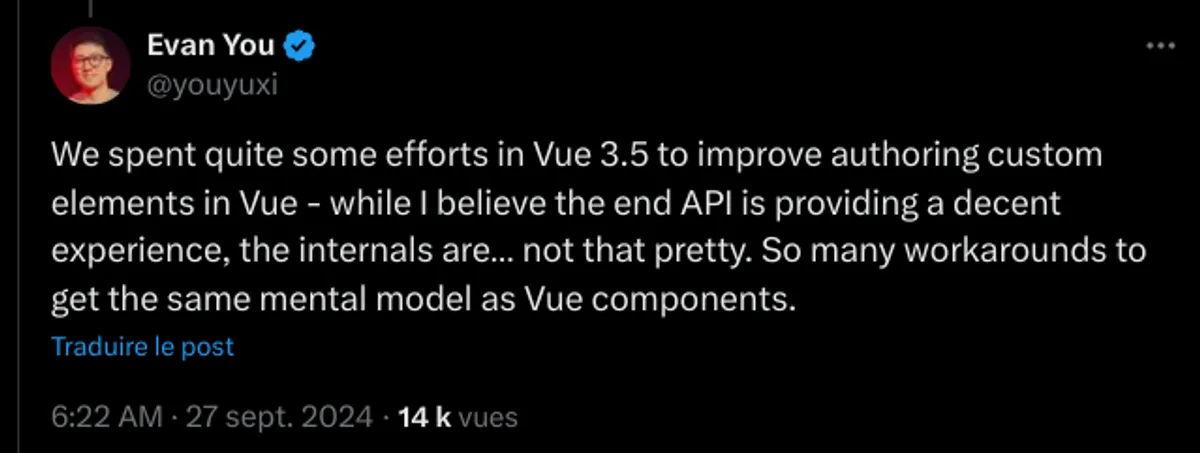
Indeed, as Ryan Carniato, the creator of SolidJS, points out, Web Components fail to meet expectations when it comes to integrating with front-end frameworks Web Components Are Not the Future. Evan You, the creator of Vue.js, has also expressed reservations on this topic in a related post
Recommandations
For companies, it seems more prudent to adopt a pragmatic approach. When possible, sticking to a single primary framework to develop and maintain the components of a Design System and its applications allows for better utilization of each framework's capabilities.
In other cases, a viable alternative is to centralize only the design tokens and cross-cutting tools. Components can then be developed natively in each target framework while maintaining consistency through the tokens.
While Stencil has its advantages, this study highlights the limitations of Web Components as a universal solution for Design Systems. It is crucial for technical teams to consider these aspects carefully before committing to a Stencil-based implementation and to explore solutions that may be better suited to the specific needs of their organization.